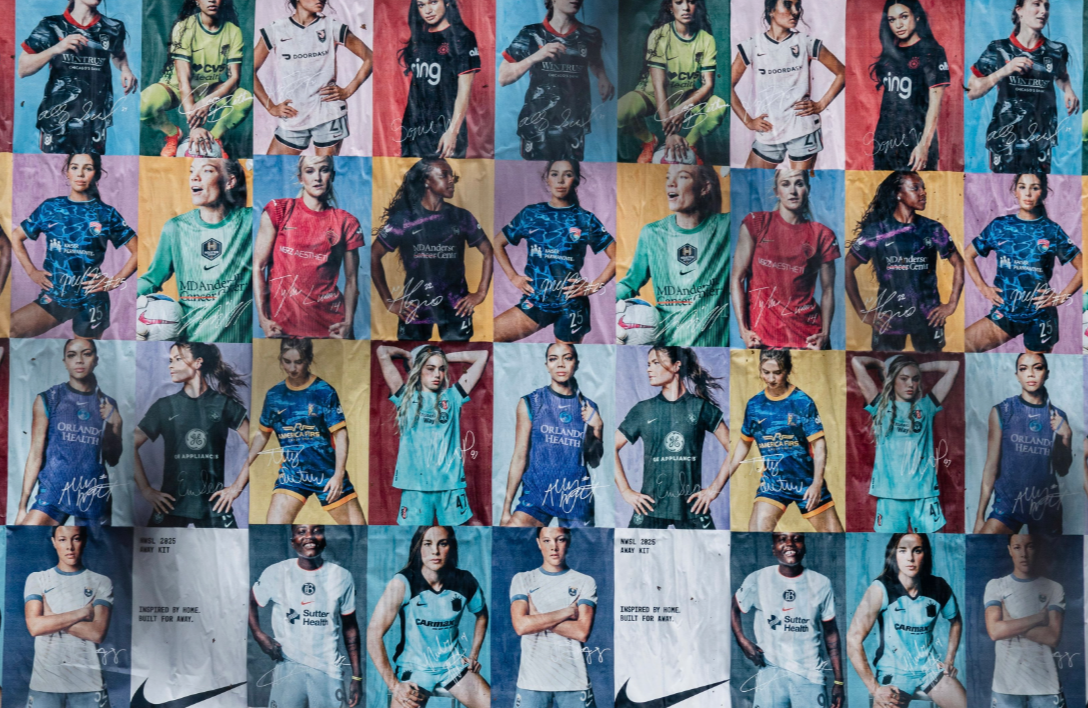
AHEAD of the 2025 National Women’s Soccer League season, Nike have revealed all 14 sets of primary and alternate kits to be worn by the league’s teams.
The custom uniforms will be debuted on March 14th, and those of Orlando Pride and Washington Spirit will be showcased first in the Challenge Cup on March 8th.
The new collection includes updated goalkeeper kits and the first set of kits for 2024 expansion team, Bay FC.
Ally Financial, the league’s official banking partner, will continue to be the shirt sleeve sponsor on all kits.
With nothing but biased opinion and a somewhat knowledge of fashion, we’re giving our thoughts from colourways to embroidery.
All kits can be found at NWSLShop.com
WASHINGTON SPIRIT
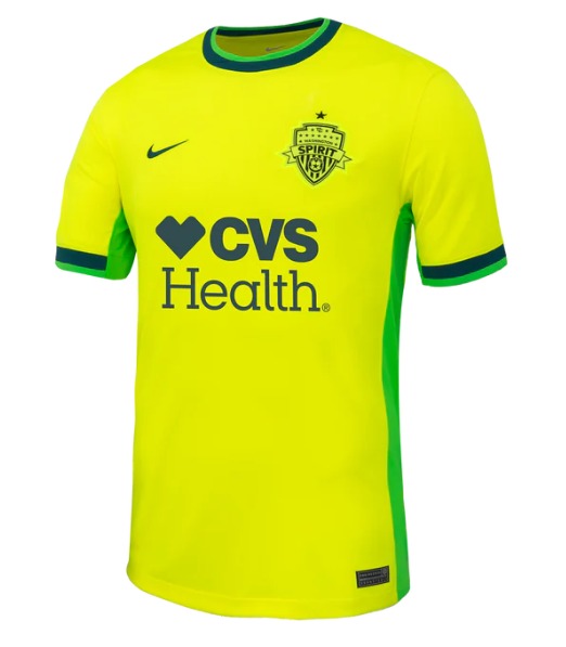
The ‘SHOCKWAVE’ kit is a nod towards owner Michele Kang’s mission to “shake foundations”.
The neon-ness of the shirt’s base colour could probably be viewed by the DCA airport traffic.
Score: 5/10
BAY FC
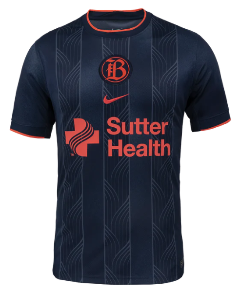
Bay FC are one of two teams to have their badge positioned in the centre of the jersey.
The obsidian colour represents “strength and confidence”, and the vertical swirly lines indicate the Bay Area’s “interconnectedness”.
As debut shirts go, it’s pretty fine.
Score: 8/10
UTAH ROYALS
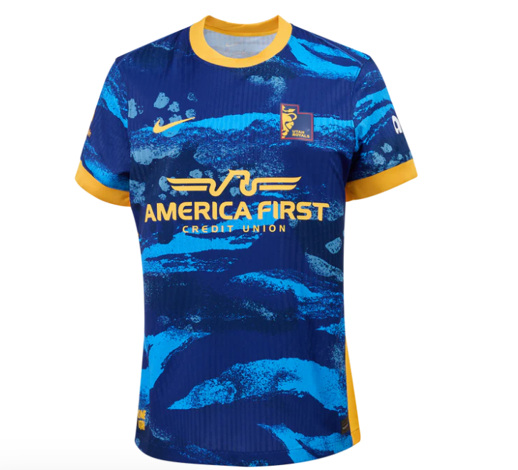
For a landlocked state, the ocean waves look is a little confusing.
However, the re-brand of the crest is very clever indeed (it matches the shape of Utah’s border).
Score: 8/10
ANGEL CITY
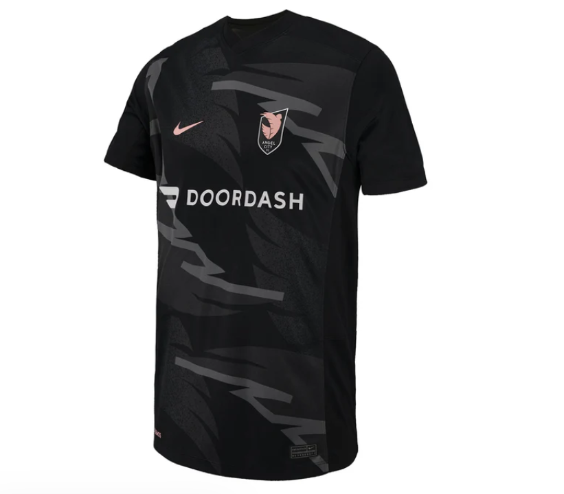
The grey zig-zags are symbolic of the wings that “burst from the crest”.
A primarily all-black kit, especially for the home strip, always slaps.
Score: 8/10
KC CURRENT
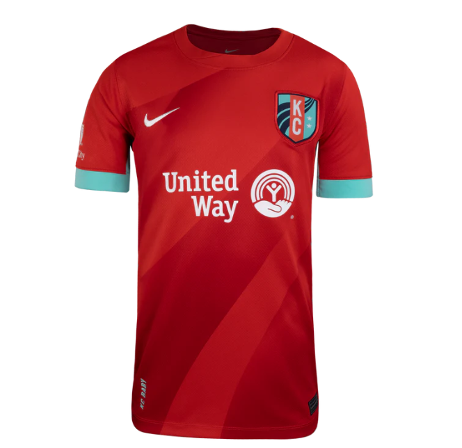
Bold red is iconic to Kansas – think of the Chiefs and Dorothy’s heels.
The teal colours and trio of stripes represents the Missouri River, which backdrops their new home venue, CPKC Stadium.
Score: 7/10
SAN DIEGO WAVE
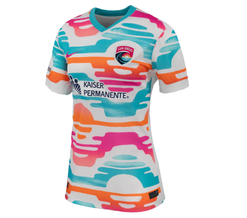
The West Coast expansion team are always crazy bold with their strip colours to reflect the vibrancy of the city.
The sunset-over-the-water design is *chef’s kiss*.
Score: 10/10
SEATTLE REIGN FC
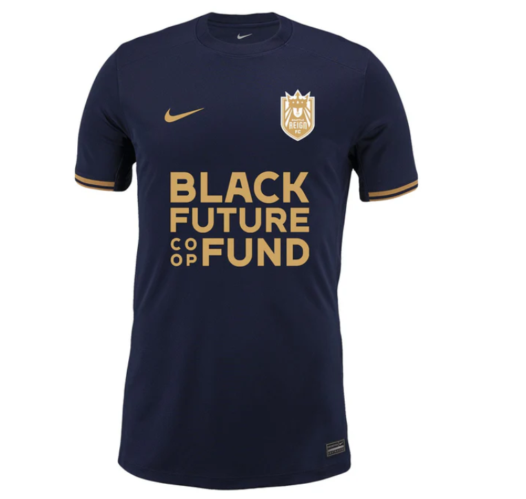
No patterns. No crazy.
But you can’t go wrong with gold accents.
Score: 7/10
RACING LOUISVILLE
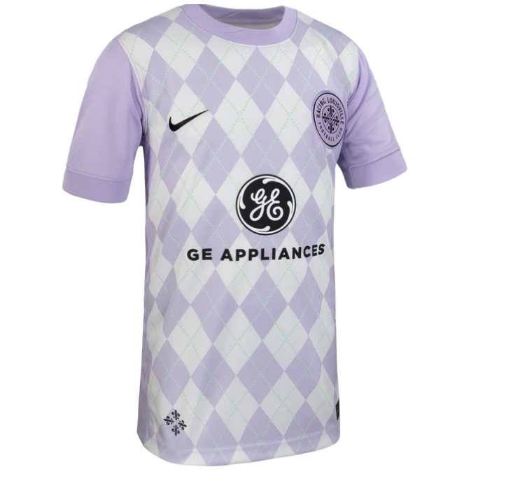
Is Louisville known for golf course attire?
Parma Violets?
Score: 7/10
PORTLAND THORNS

Portland have continued to stray from their classic red and black colours this season.
The design includes thorn patterns, and the city’s initials “PDX” are stitched into the bottom left of the shirt in pointy capitals.
Score: 6/10
ORLANDO PRIDE
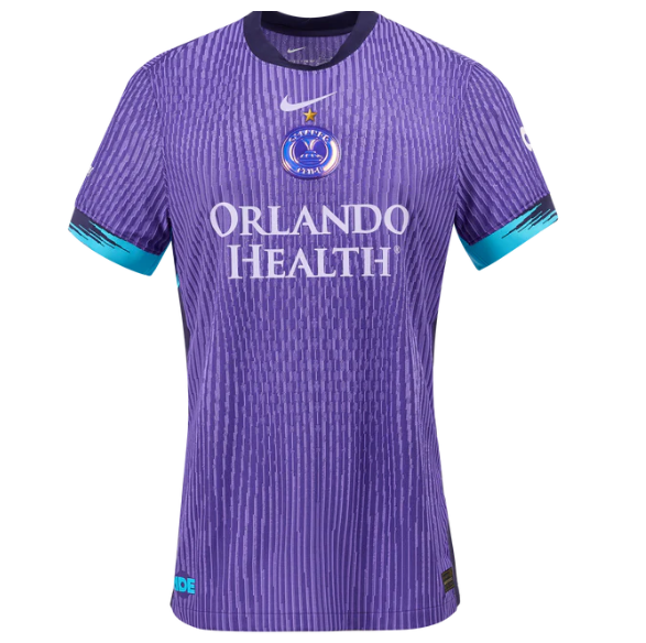
There’s a lot going on here; it looks almost like an optical illusion.
The purpose of the design is to bring together small parts of their previous ten strips.
And, of course, don’t miss the necessary addition of the gold star above the crest after their first Championship title win last season.
Score: 6/10
HOUSTON DASH
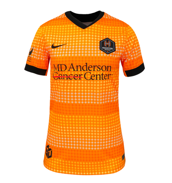
One word: J A Z Z Y
Score: 9/10
NORTH CAROLINA COURAGE
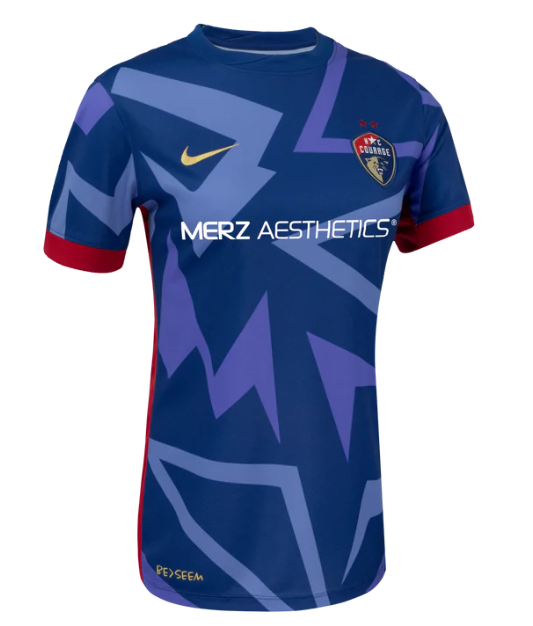
The triangles represent “the angles of attack the team throws at its opponents”.
Our eyeballs have definitely been attacked, but in a good way.
Score: 8/10
NJNY GOTHAM
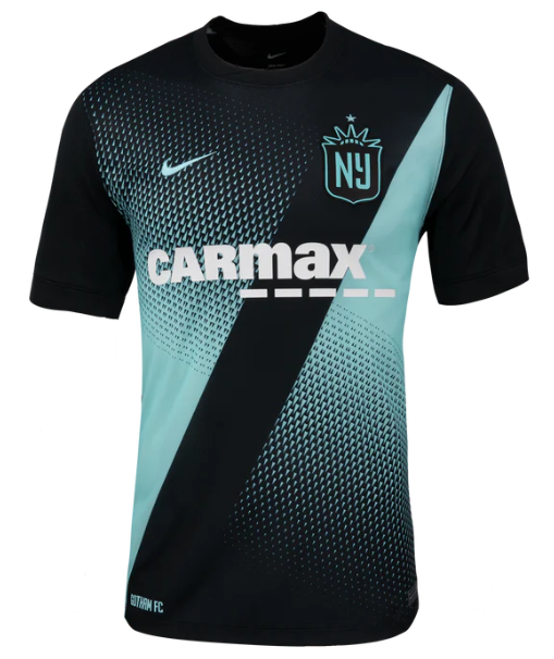
It’s giving 2015 PowerPoint vortex slide transition.
Score: 6/10
CHICAGO STARS FC
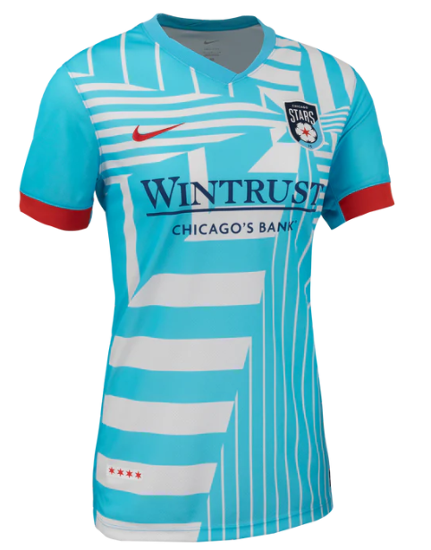
2025 will be the first season that Chicago will identify as Stars FC and not the Red Stars.
Despite the name change, they have kept the state flag’s colours and the four-star emblem.
The colours work but the graphic is a bit chaotic, as is the $130 price tag.
Score: 7/10