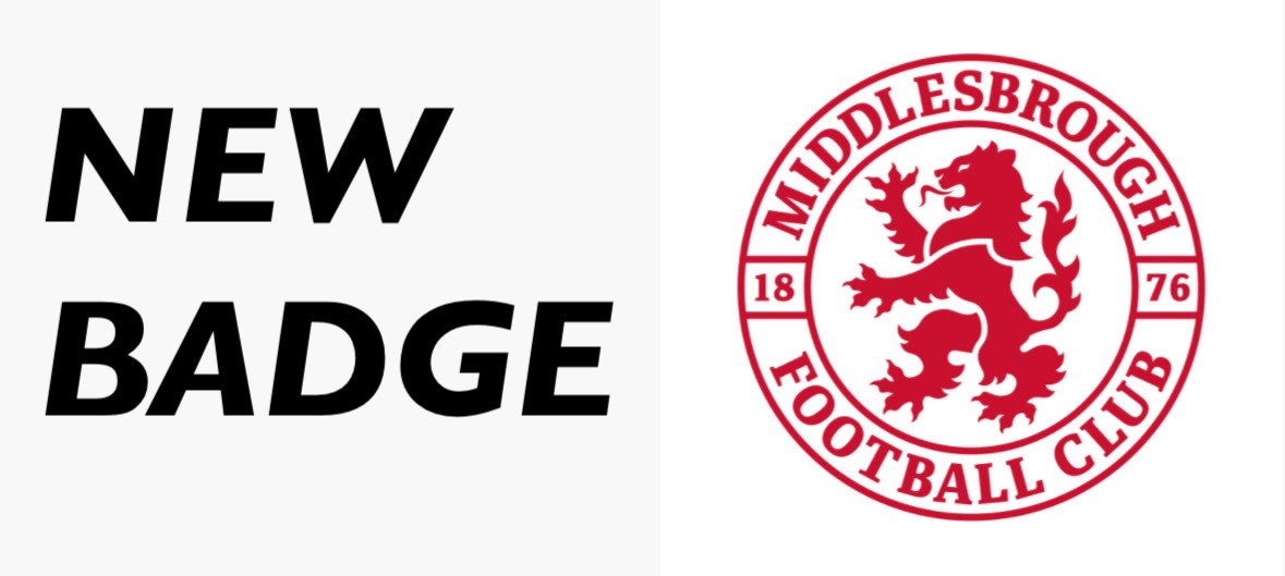
Middlesbrough have announced they will change their club badge from the start of the 26/27 season, scrapping their current shield design for a more modern circular template to honor their 150 year anniversary.
The fresh crest provides a sleek sense of elegance whilst paying tribute to their past by featuring their classic red lion front and central to the logo, and has been subject to mixed options by Boro fans online.
A club’s badge is central to its identity. It’s stitched into the shirt, etched into the stands, and a symbol for a club to be recognized. However, keeping up with the changing times and staying relevant is equally important to football clubs worldwide, and sometimes, change is necessary.
However sometimes it simply isn’t necessary at all, and there have been many occasions in which a club has produced an unpopular or downright ugly new badge, while failing to properly consult it’s fans before imposing such a significant change. Here’s a look at the top 5 worst badge changes in football.
- Aston Villa, 2023
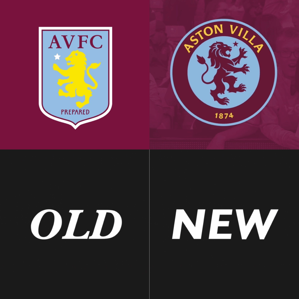
Undoubtedly the biggest flop in badge history. Ason Villa fell for the trap of scrapping its heritage for a commercial template. In proposal it looked okay, and won over fans votes – but on the kits it looked tacky, and was heavily criticized by Villa and football fans alike.
Critics likened the newer badge to Chelsea’s, labeling it unoriginal. The badge was so vastly unpopular that it was ditched after one singular season – despite the one season being a huge success on the pitch – 23/24 was Aston Villa’s highest Premier league finish in a staggering 28 years.
Aston Villa acted quickly upon fans disapproval, and in 2024, a new identity was born – a slightly tweaked and modernized version of their traditional sky blue shield badge
2. Cardiff, 2012
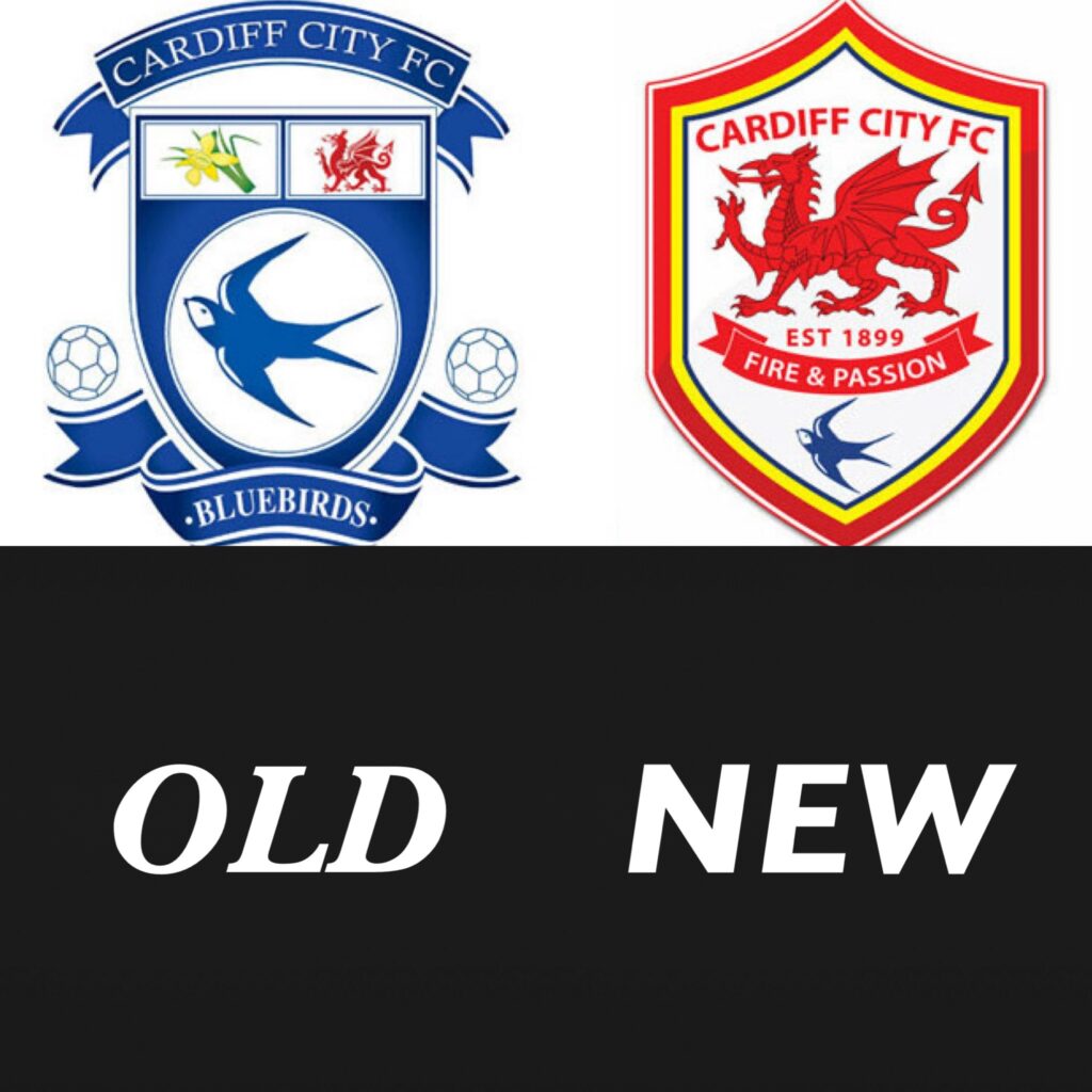
When it comes to rebranding, switching the a club’s colour, is about as extreme as it gets. And as for color changes, it doesn’t get more bold than changing from blue to red. A clubs colour is the one constant thing that never changes, that is unless you’re Cardiff City owner Vincent Tan.
Nicknamed ‘The Bluebirds’, getting rid of the iconic bluebird from the centre of the crest for no good reason went down terribly with Cardiff fans – and after constant pressure and protests from the fans, the club reverted their kit color back to blue, and the iconic bluebird was returned.
3. Manchester City, 2016
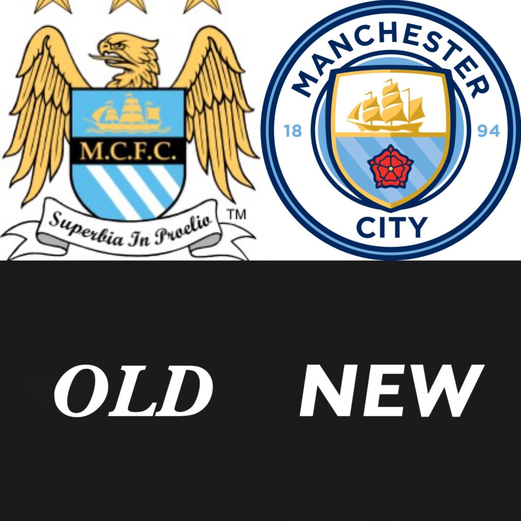
While Manchester City’s on-field success since this badge change cannot be questioned – winning the league 6 times in 9 years since the switch – the badge is not immune to scrutiny. In 2016, Manchester City replaced a bold, striking eagle and shield, with a more modern, sharp, circular logo, while keeping the color scheme and iconic ship and mast.
Manchester City where one of key trendsetters when it comes to the circular badge – since 2016 we’ve seen hundreds of sides worldwide switch to a circular badge. Why? Well, versatility is the answer. Circles fit neatly on almost any background, shirts, social media icons, etc – they don’t have awkward or rigid corners.
While the new badge provides convenience and modernity, it can’t be argued that the personality was sapped from the crest upon removing the eagle. The updated badge is nowhere near as intimidating or unique, however Manchester City’s tremendous on-field success leaves little room for complaints among the fanbase.
4. Tranmere Rovers, 2021
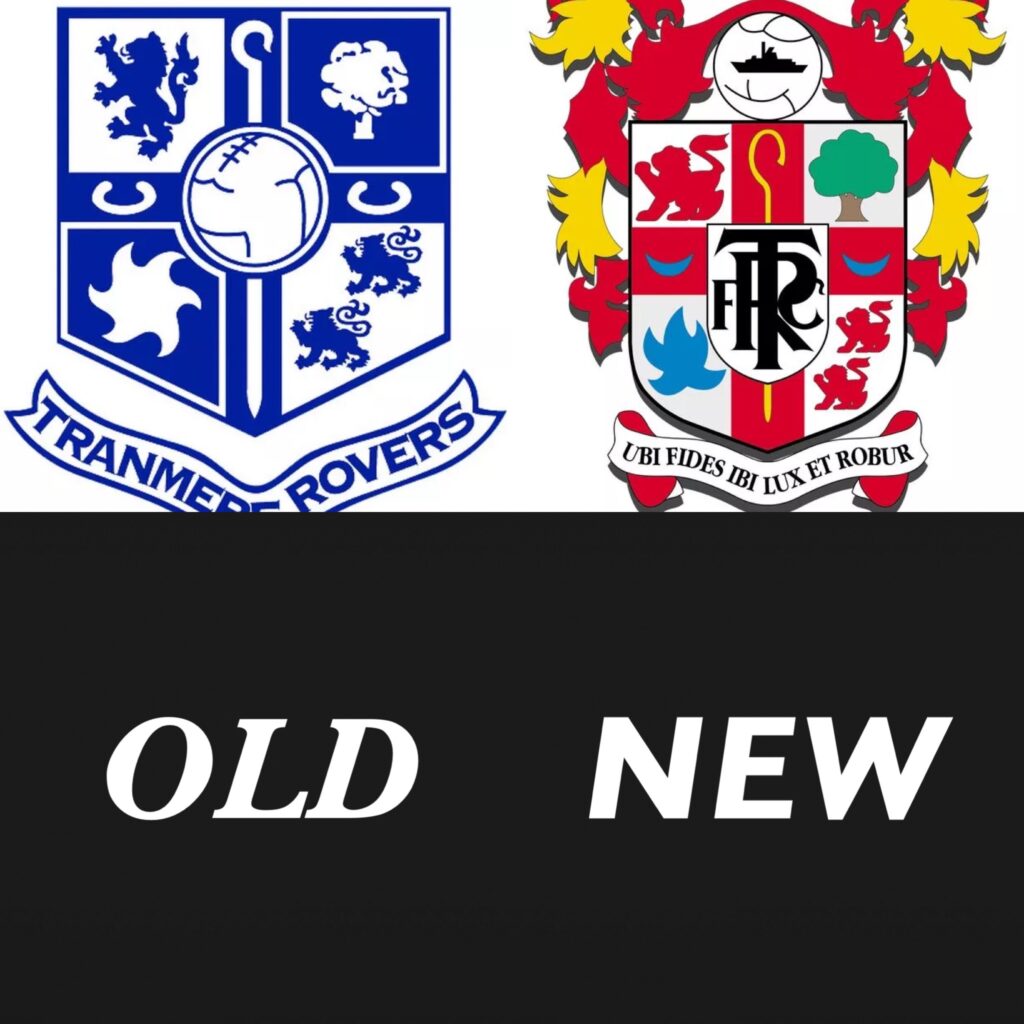
Now, If the text ‘Tranmere Roves’ was removed from the first badge, you simply wouldn’t be able to tell these two badges belong to the same club because of how vastly different they are.
And is it really an upgrade? The new badge looks messy and quite frankly weird, while the older one does have more resemblance to a secondary school logo than a football club, it’s certainly easier to look at than the newer badge.
Tranmere have gone back and fourth between these few logos for years, however the current one has been in place since 2021.
5. Juventus, 2017
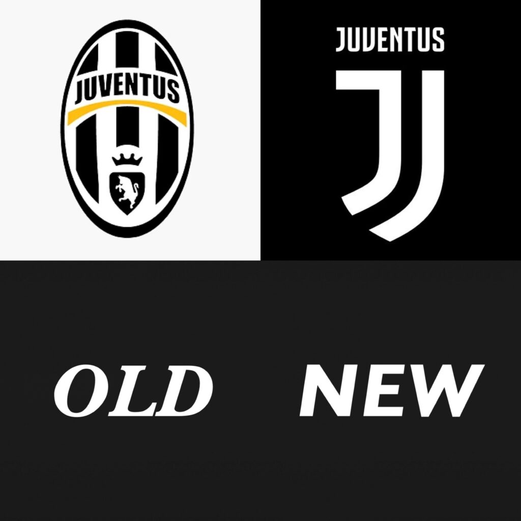
Juventus opted for a modern, minimalist switch as part of a rebrand strategy in an attempt to modernize the club’s image.
Nicknamed The Old Lady, Juventus are one of the most successful clubs in Italy, priding themselves on their history, and this badge received barrages of criticism when it was announced. Critics labeled the stylized ‘J’ too simple and lazy.
Juventus’s president at the time, Andra Agnelli, explained that the goal was to turn Juventus into a global lifestyle ad brand – and while the ‘J’ is certainly more unique and iconic, the overall perspective of fans over in Turin has been a negative won since it was announced.